hello scorsese
In an attempt to make commercial a more unique style of both storytelling and advertisement, Martin Scorsese and Rodrigo Prieto teamed up with Squarespace to make a little TVC/short film (1.37 mins) about aliens.
The thing that I fell in love with the most however is the beautifully simplistic look of the interior night lighting.
Night interiors are rough…very rough…how much fill light, where does the light come from, how dark is too dark, how light is too light!!! It’s a pain in the ass because there are no right answers…but plenty of wrong ones.
Today I want to look at the opening scene of the boy in front of the TV. It isn’t a big, move-through-the-space scene but therefore its all about simplicity and visual intersting. Luckily, what we have is a the behind the scenes video with a few hints at what Prieto has used and also how he has exposed the scene which we will get into. First though, have a look at the extended commercial below.
It’s stunning right. It has a real “close encounters” feel to that opening scene…and I know, its only really three shots on the kid but the lighting and feeling of the scene are brilliant! Especially for a stage built set.
One of the things I love the most, having looked at the behind the scenes is how free the set feels. It looks as though the only light that is on the floor of the set is the key light and even then it appears to be really low impact. Having looked through a lot of BTS of Prieto’s work, that does seem to be a consistent throughline. Make the set up as simple as possible, and look, we have all tried this…BUT…sometimes it looks like the love-child of a student film and a steaming pile of….you get where im going with this.
The trick to this is to find a key source that you like and gives you what you need and balancing the levels and exposure of the rest of the scene. If you have a great key on your talent on a mid shot but your mid ground and back ground are just clipped blacks with no depth….then its gonna suck and I think thats where Rodrigo’s skill is. He can light for depth. Let’s be honest, Scorsese knows where he wants that camera so I don’t want to look at the framing too much because although Rodrigo has his hand in that also, I want to look at his real skill which is his lighting.
Lets look at these stills and break down the depth and layers.
THE FALSE COLOUR:
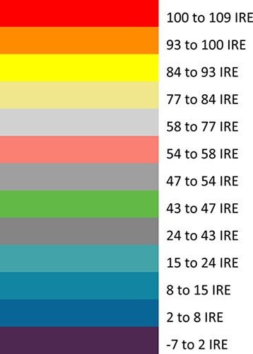
Have a look at these BTS shots below. You can see really clearly (thank god) that there is a false colour monitor on the DIT cart. That monitor is a Convergent Design 7Q+ monitor. The thing i find really intersting is how Prieto has balanced his exposure. You can see the key side/left side of the kids face is GREY which usually is an IRE 47-54%; I found the below whilst trying to look for reference images of skin tone placement on an IRE scale.
"On a traditional waveform monitor the “flesh line” is at 55 to 60 IRE. However, white skin renders best at 60 to 70, while brown skin may show better at 48 to 52 IRE. Darker subjects or scenes may render best at 40 to 48 IRE in order to keep other values in check, like shadows and highlight details" - Videomaker.comIf you look closely you find that the Key side of the kids face and the lamp is the same colour, meaning that they have the same bracket of IRE value…meaning their exposure is somewhat the same…interesting. You usually expect that them to be a bit brighter, usually because you want to use that light in your scene but this just means that any other light pushing into the room from this “source” will be augmented with another light out of frame.
The other thing I love seeing is the use of checkboarding. Looking at that false colour image tells us sooooo much. Looking at the background only, the frame from left to right gradually gradients in exposure. The far right side is purple meaning an IRE bracket of 8-15% roughly, the middle behind the kid is green with an IRE bracket of 43-47% and then the left on the left of frame and the face of the kid is in the IRE bracket of 47-54%.
Now, the checkboarding - this is the process of layering exposure so you have light-dark-light-dark and so on when looking at an image. You never have a highlighted section i.e the kids face over the lamp, you would put the kids face over a darker tone such as a darker wall or distant hallway. now look at that this image below and see how even the back light/edge light on the kid (right side of his head) is over a lower exposure section of wall. This is a simple technique for lighting for depth but so very effective, especially in low-key, dark scenes.
FALSE COLOUR GENERATED IN DAVINCI RESOLVE
The images overall don’t clip to black, this is a real skill and the sign of a pro. Not saying that pro’s don’t clip black or white on purpose but it’s their control of their craft that they can have all the blacks held with information even in the darkest points in the frame without it feeling “lit” or “unnatural”. Now, they have shot on a Sony venice which is wonderful in low light situations and so if you were in a pinch you could hold those shadows/Zones 1 & 2 of your image just that little bit more but it is very clear that Rodrigo has intentionally done this.
Lets look at some lighting shall we.
Well there is your key light, and Id make a fairly educated guess that they just moved that light in for the close up!
Lets breakdown this wide lighting set up:
Ambience - There is a soft top light. Maybe a heavy grid cloth over the whole set with an eggcrate and a few skypanels. The only reason I say with an eggcrate is that its very controlled. No spill onto the walls that isn’t controlled. Really this is only there to play very very low but ultimately stop any clipping. You could make this light a bit cooler than your 3200K key sources so that your shadows go cold and you have more colour depth in your image.
Direction Back Edge - As you can see on the couch arms, curtains, kids head, there is a soft backlight abouve the set wall directly in front of the kid. Id imagine this is a big 4x8 poly bounce or something large and soft, id also imagine it maybe doesn’t have a grid as you don’t need to worry about the spill because it is behind the set wall. Maybe a few flags to control? But this seems to just add genral “pop” and seperates your layers nicely.
Window - This cool single sourced lamp is purely to light the shutters and the sheers. Maybe to motivate the cooler shadows in the room but ultimately it is for colour seperation. Without this you would have a very monotone image. When lighting with high satration i.e warm interiors, it is important to have a cooler tone inside the room to give you depth, seperate and avoid the feeling of over saturation.
Lamp - What kind of cinematographer will say no to a lamp. This is for visual interest, it is very dimmed down, to the same IRE as the key light on the right side of the boy but helps motivate the warm sources in the room. Without it, you would unconsciously feel as through there is something missing in the space.
TV - Duh.
Key Light - Hidden to the right of frame, tucked behind the couch and out of shot by the door frame is a large square litemat with a grid to avoid the spill onto the walls. This is motvated by the practical lamp that we see in the next frame. You need to work out within your space, where is your key source going to come from. You can move all your other light aorund in your scene from shot to shot, but really you want to keep your key source consistent.
The Clever Light - This is where Prieto let his professional show a little. You could have left the scene with all the above and have a beautlful looking image BUT it wouldn’t have felt complete. This next one requires some skill, because it is an unmotivated source and a lot of people might have turned their nose up at it until they see it. Hidden behind the chair on the left side of frame is a small eggcrated source pushing a cool blue tone, same as the moonlight from the window across onto the other side of the boy. You end up with a “Balanced Frame” - this about it. The lamp on the left but the warm soft light coming from the right and the blue hard moonlight from the right hand side but the soft blue tone coming from the left.
LIKE WHAT THE FUCK!!!!!
He has checkboarded with colour!!! Not just the exposure but with the colour, his trick is that he has contorlled everything so the colour tones don’t mix. If they had mixed then you would have had a very muddy wash of colour but having them seperated on either the subject or the background gives you that beutiful checkboard tone.
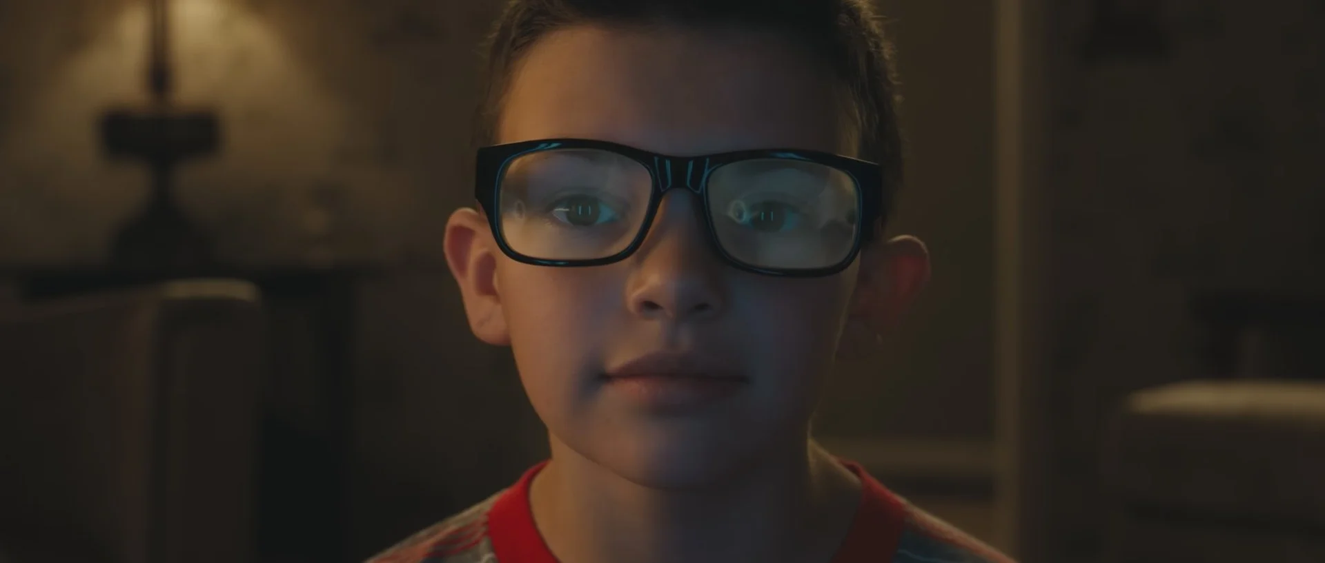
THE CLOSE UP:
Same same but different right.
KEY LIGHT - They have moved that key light in and around, notice how it doesn’t play in the glasses, very controlled - this is motivated by the lamp in the background, which….makes no sense but looks damn good. KEEP YOUR KEY CONSISTENT.
EDGE LIGHT - They have turned that backlight off from the wide or…yah know…it would be called a front light. Remember that secret blue edge light he had tucked behind the chair, yep, same shit but not its warm. Motivated by what????? say it with me kids. THE LAMP. Yep. That lamp is turned off but that edge light is playing.
BACKGROUND LIGHTING - What they have done. Again, making sure thy have that depth is place a light outside in that corridor in order to light the door frames, not the walls just the frames to keep that checkerboard. Notice the right hadn side of his head it goes Edge light(light) - hallway wall (dark) - doorway edge (light) - room interior wall (dark) - Chair of arm (bright) STUNNING!!!!!!!
Lamp - Duh!
Eyes - That front blue tone is coming from the TV reflected in his glasses. My bet for this shot is that they have comped that tv reflectionin glasses but have put the camera in front of him and notice the two vertical tubes in his eyeballs….yeah they are Astera Helios tubes either side of the camera lens giving that blue tone on his face.
Ok my fingers hurt now. Hope yah liked it. Bye bye.


